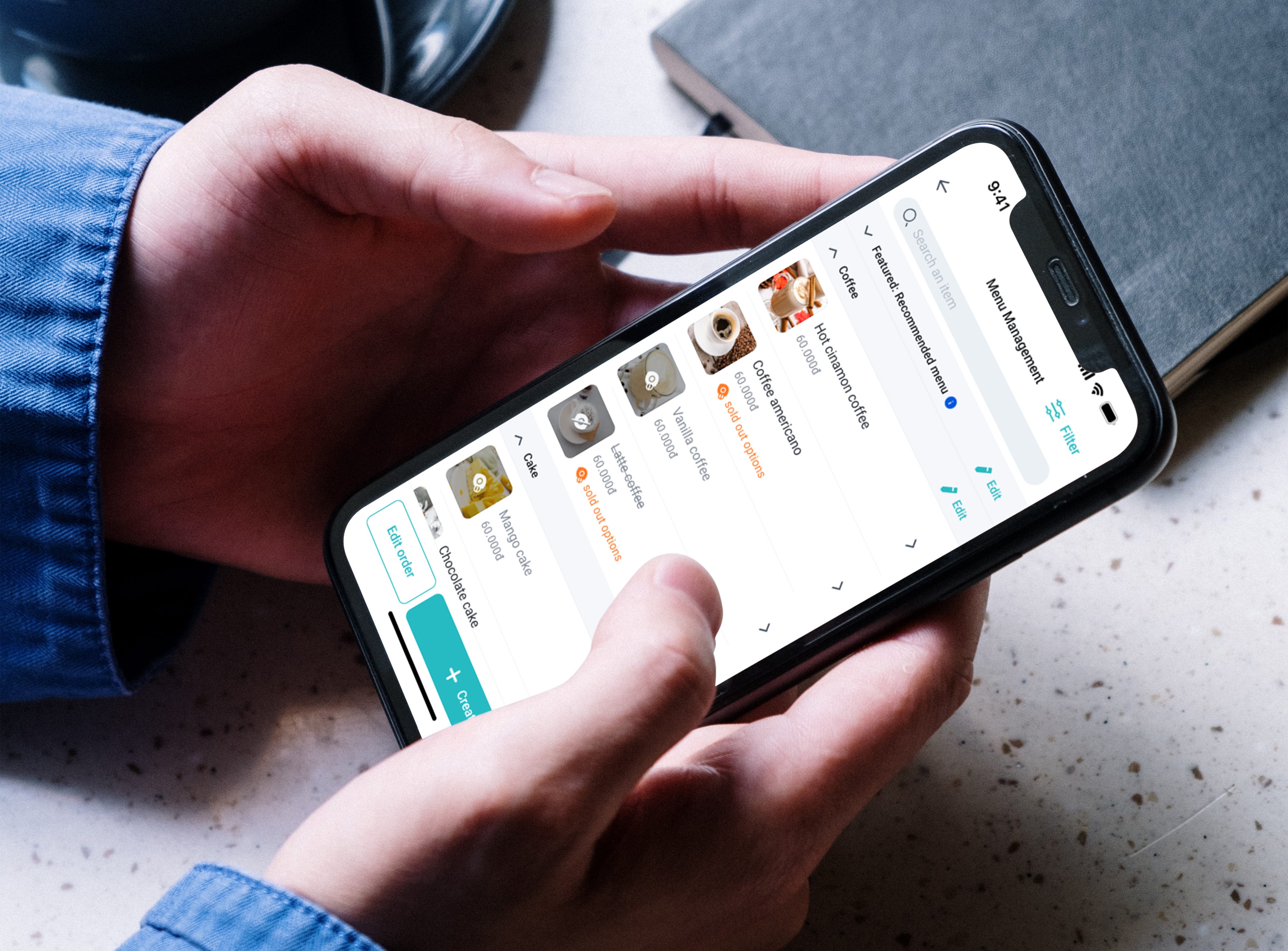
The improvement of BAEMIN Merchant’s Menu Management experience: UI/UX Case study
As a merchant, the demand for editing and adding new items to the menu is exceptionally high. Failing to update new items or prices promptly can significantly impact their profits. Furthermore, there arises a conflict between the menus of the same merchant on different food delivery apps when updating becomes challenging. This, in turn, leads to the loss of customers as they struggle to decide which platform to use for ordering food.

Project brief
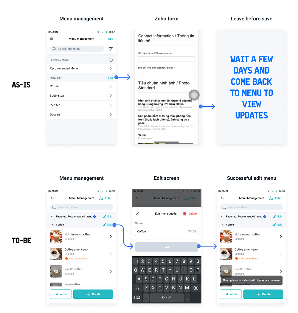
The menu has always been a crucial feature for merchants, and keeping it up-to-date is vital. Unfortunately, we have been relying on a third-party service, Zoho form, for merchants to submit menu update requests. This setup creates a barrier for the merchants themselves, discouraging frequent changes when needed.
In our upcoming renovation phase, we aim to replace the cumbersome third-party form with a more user-friendly in-app flow. Our belief is that this change will encourage merchants to update their menus more frequently, ultimately benefiting their business and enhancing customer experience.
Research: Uncovering the problem from user’s perspective
In H2'2022, 21% of BM users were frustrated because some food items weren’t listed or updated, as per User NPS data. The Merchant NPS in Q1'2022 revealed that 52% of 3460 merchants found menu management to be a significant pain point, contributing to the problem. In late 2021, merchant interviews highlighted that slow approval and response times (2–3 days) made it tough for them to update menus regularly.
Objectives and Goals
What we want to achieve:
- To improve the performance and usability of the feature.
- To reduce unnecessary input information and allow merchants to create, edit, and delete items themselves.
- To add the menu right away without waiting for approval from the Merchant Ops team.
- To encourage merchants to update their menu more frequently.
- To decrease menu SLA tickets from merchants, which are handled by Merchant Ops, from 3.5 working days to 1 hour.
We’ve set up some key metrics:
- We will track this goal in the next NPS/CSAT survey.
- We will track the Feature Performance Evaluation of Menu Self Service after its release, measuring adoption rate and manual menu-update tickets assigned to Ops based on the Voice of MCs reports.
Merchant’s objective:
In order to grasp the root causes of user pain points, we need to reassess their expectations regarding menu management. Here are four fundamental requirements ranked by their frequency of use:
- View item/category details
- Update stock availabilities → Toppings are the most frequently updated items.
- Add new item/category
- Edit old item/category
By understanding these priorities, we can focus on addressing user needs and enhancing their experience with the menu management process.
Heuristic Review

When we look at the four values provided to the users, this scene hardly meets their demands:
- View items/categories details — Not quite there
- Update stock availabilities — Unavailable
- Add new item/category — Not clear
- Edit old item/category — Not clear
Overall, the current situation falls short of fulfilling the users’ expectations in these areas. Improvements are needed to bridge the gap and cater to their needs effectively.
Competitive analysis

To conclude, we need a solution which satisfies 4 of those needs
Solution
Reverting the main menu screen
After considering the common behavior of other apps in the Vietnam market, I’ve made the decision to enhance user experience by removing the external step/screen required to view items in the menu list. I plan to merge the Menu list and Item list into a single screen to simplify navigation.

However, I’m aware that this change might pose some technical challenges due to the limited performance of the Sunmi device. Nevertheless, we will closely monitor the situation and explore potential technical solutions to ensure a smooth implementation.
Existing issues & Challenges with the Current flow

The current as-is menu presents several challenges for users. Firstly, it involves a long and cumbersome form requiring additional identity-related details, which doesn’t contribute to their progress. Secondly, the operation team faces significant delays in manually checking and processing the requests, leading many users to resort to alternative workarounds to update their menu promptly.
Moreover, the technical constraints make the definition and structure of items, options, and option groups quite complex, making it difficult to optimize the user experience (UX) design and usability of this feature.
Additionally, the BM menu’s unique structure compared to other apps poses a challenge as it prevents consulting the flow of competitors for insights.
Reverting the flow
In this case study, we will focus on some of the main flows of this significant feature with its complexities and logic. Let’s start with…
1. Create new menu section flow:

Since most merchants are low-tech users, I plan to make the “Create” button more prominent to encourage them to update their menus more frequently. By doing so, we aim to simplify the process and empower merchants to manage their menus efficiently.
2. Create new item flow:

The revised flow is designed to be much more straightforward and user-friendly, eliminating unnecessary information that merchants previously had to provide. This enhancement aims to streamline the process and make it more efficient for merchants to add new items to their menus.
3. Create the option group and option:
This part is like solving a puzzle because our BM app’s menu structure is quite different from other food apps. It can be a bit tricky for merchants to understand how option groups and individual options work. We tried out lots of different designs and tested them to find the best way for merchants.

We’re putting groups and option settings together on one screen to make things really clear. Merchants start by making the first options group, and once they get the hang of it, they can create more groups if they want.
Right now, the flow might feel a bit like a rollercoaster, but don’t worry — we have a plan to make things smoother down the road. Just remember, changing the menu structure takes time, but we’re committed to making it better.
4. Edit & Delete menu section:
In the previous setup, merchants weren’t able to easily delete sections or items. They had to reach out to BM hotline or hide items, which was quite inconvenient.

To strike a balance, I’ve made some changes. While I want to avoid frequent deletions, I’ve placed the delete button in the edit screen, adding an extra step for merchants. Additionally, the confirmation popup will emphasize the number of items affected, serving as a reminder of the impact of their action. This way, we’re aiming to make menu management smoother while keeping important decisions in check.
5. Edit & Delete item details

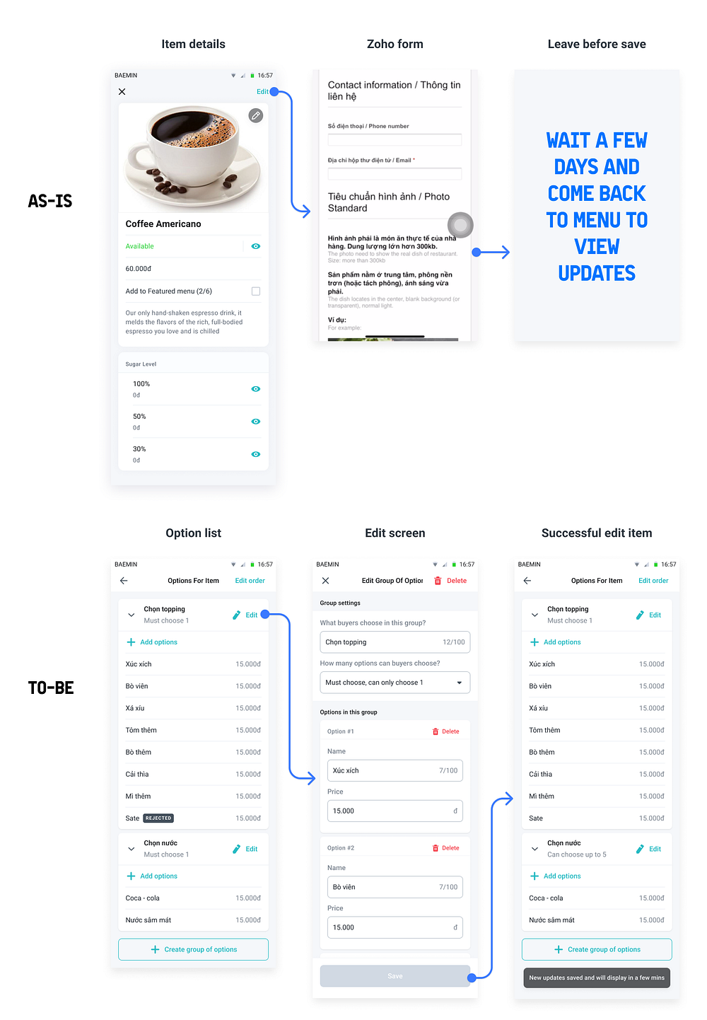
This screen is pretty complex, with lots of things merchant can do. I’ve made sure to organize everything in a way that makes sense for merchants, giving more importance to what matters most. I changed how some things look to help classify them better — for example, I used different styles for different info.
To make things easier for our older and less tech-savvy merchants, I switched from just icons to buttons with both icons and text. I also tweaked the eye button, making it an eye with an arrow. This way, it’s clear that you can click it and that there’s more than one status connected to it, showing an item’s status.
The layout got a makeover too. I went for a full-width look, except for options which still have cards. This makes it obvious that options belong to items.
Each section now has a special header with the section’s name, an edit button, and a different background color. This helps keep things separate and organized, so different things you can do on the screen are clear.
6. Edit & Delete options:

This screen is a bit tricky to design because the idea of group options and options can confuse merchants about their purpose. And there’s a bunch of things happening on this screen that need to be placed carefully to avoid misunderstandings.
In the item details section, all the options need to be listed, while in the edit screen, options can be in a dropdown. This is because the two screens have different main purposes. In the item details screen, the main thing is changing options’ status, so merchants need to see all options together. But in the edit option screen, the main focus is editing, so the dropdown layout helps merchants quickly move to specific option groups.
For these types of options, I thought it would be best to allow editing and creating multiple options at once. Since there are usually many options, creating several together is more convenient for merchants.
In the create scree, the “Add options” and “Create group of options” are both create actions, but the challenge is to make them distinct. To do this, I put the “Add options” button higher up because when merchants think about “Creating new options,” they usually mean adding new options to the list. Both buttons should be on the same screen so merchants can see them as separate actions, and their positions help merchants connect what they’re doing.
There’s more to talk about, like the process for the Ops team to check and disapprove items, and changing the order of sections, items, and options. But for now, let’s stick to what’s important in this case study.
Results for first phase
Release plan
At first, we’re introducing parts of the new feature to smaller businesses (SME merchants). For franchises, we’ll continue to provide manual support since they often need to update multiple chains all at once.
Our achievement
Our Key Metrics:
By giving MCs (Merchants) full control over updating the menu, the feature has made a big impact:
- Overall, the feature was used by many MCs, with over 268,000 updates and a 20% adoption rate among active partner MCs (excluding Brand Menu & KAM) after its launch.
- It led to an impressive -83% decrease in manual menu-update tickets, based on reports from MCs in November (pre-launch) and January (post-launch).
- The rate of the issue “Some food items are not listed or new items are not updated” dropped from 21% to 14% according to User NPS in H1’2023.
- Menu management is no longer the biggest pain point in Merchant NPS H1’2023, although there’s still room for more improvement.
- Merchants have been sharing positive feedback and are happy with the results.

Lesson Learned
This challenge was quite exciting, dealing with a big and complex feature, along with its various flows, logic, and UI skills. Along the way, I’ve gained valuable insights on how to make the most of our resources and handle technical constraints. As a product designer, I’ve come to understand that perfection isn’t always attainable, but what matters most is creating something that best meets user needs at the time. Through continuous learning and improvement, we can make a growing impact on our users and keep delivering better experiences.
